Pink is a pale red color that is named after a flower of the same name. It was first used as a color name in the late 17th century. According to surveys in Europe and the United States, pink is the color most often associated with charm, politeness, sensitivity, tenderness, sweetness, childhood, femininity and the romantic. It is associated with chastity and innocence when combined with white, but associated with eroticism and seduction when combined with purple or black.
History, art and fashion
From prehistory to post-classical history
The color pink has been described in literature since ancient times. In the Odyssey, written in approximately 800 BCE, Homer wrote “Then, when the child of morning, rosy-fingered dawn appeared…” Roman poets also described the color. Roseus is the Latin word meaning “rosy” or “pink.” Lucretius used the word to describe the dawn in his epic poem On the Nature of Things (De rerum natura).
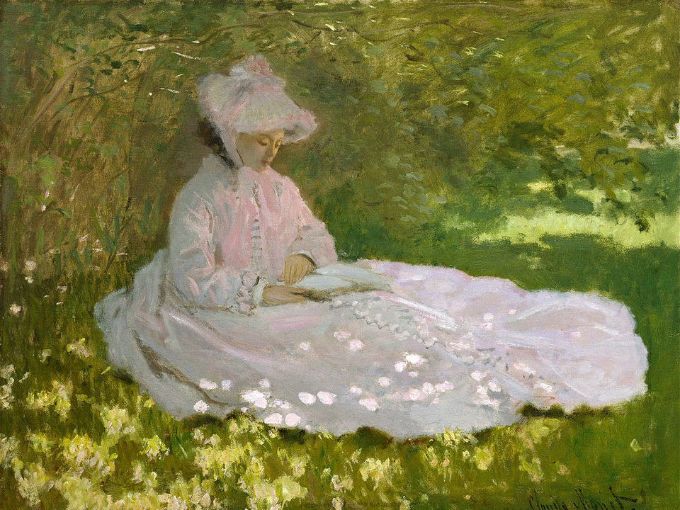
Pink was not a common color in the fashion of the Middle Ages; nobles usually preferred brighter reds, such as crimson. However, it did appear in women’s fashion, and in religious art. In the 13th and 14th century, in works by Cimabue and Duccio, the Christ child was sometimes portrayed dressed in pink, the color associated with the body of Christ.
In the high Renaissance painting the Madonna of the Pinks by Raphael, the Christ child is presenting a pink flower to the Virgin Mary. The pink was a symbol of marriage, showing a spiritual marriage between the mother and child.
Modern history
Early modern
During the Renaissance, pink was mainly used for the flesh color of faces and hands. The pigment commonly used for this was called light cinabrese; it was a mixture of the red earth pigment called sinopia, or Venetian red, and a white pigment called Bianco San Genovese, or lime white. In his famous 15th century manual on painting, Il Libro Dell’Arte, Cennino Cennini described it this way: “This pigment is made from the loveliest and lightest sinopia that is found and is mixed and mulled with St. John’s white, as it is called in Florence; and this white is made from thoroughly white and thoroughly purified lime. And when these two pigments have been thoroughly mulled together (that is, two parts cinabrese and the third white), make little loaves of them like half walnuts and leave them to dry. When you need some, take however much of it seems appropriate. And this pigment does you great credit if you use it for painting faces, hands and nudes on walls…”
Late modern
The 18th century
The golden age of the color pink was the Rococo Period (1720–1777) in the 18th century, when pastel colors became very fashionable in all the courts of Europe. Pink was particularly championed by Madame de Pompadour (1721–1764), the mistress of King Louis XV of France, who wore combinations of pale blue and pink, and had a particular tint of pink made for her by the Sevres porcelain factory, created by adding nuances of blue, black and yellow.
While pink was quite evidently the color of seduction in the portraits made by George Romney of Emma, Lady Hamilton, the future mistress of Admiral Horatio Nelson, in the late 18th century, it had the completely opposite meaning in the portrait of Sarah Barrett Moulton painted by Thomas Lawrence in 1794. In this painting, it symbolized childhood, innocence and tenderness. Sarah Moulton was just eleven years old when the picture was painted, and died the following year.
The 19th century
In 19th century England, pink ribbons or decorations were often worn by young boys; boys were simply considered small men, and while men in England wore red uniforms, boys wore pink. In fact the clothing for children in the 19th century was almost always white, since, before the invention of chemical dyes, clothing of any color would quickly fade when washed in boiling water. Queen Victoria was painted in 1850 with her seventh child and third son, Prince Arthur, who wore white and pink.
The 20th century
In the 20th century, pinks became bolder, brighter, and more assertive, in part because of the invention of chemical dyes which did not fade. The pioneer in the creation of the new wave of pinks was the Italian designer Elsa Schiaparelli, (1890-1973) who was aligned with the artists of the surrealist movement, including Jean Cocteau. In 1931 she created a new variety of the color, called shocking pink, made by mixing magenta with a small amount of white. She launched a perfume called Shocking, sold in a bottle in the shape of a woman’s torso, said to be modelled on that of Mae West. Her fashions, co-designed with artists such as Cocteau, featured the new pinks.
In Nazi Germany in the 1930s and 1940s, inmates of Nazi concentration camps who were accused of homosexuality were forced to wear a pink triangle. Because of this, the pink triangle has become a symbol of the modern gay rights movement.
The transition to pink as a sexually differentiating color for girls occurred gradually, through the selective process of the marketplace, in the 1930s and 40s. In the 1920s, some groups had been describing pink as a masculine color, an equivalent of the red that was considered to be for men, but lighter for boys. But stores nonetheless found that people were increasingly choosing to buy pink for girls, and blue for boys, until this became an accepted norm in the 1940s.
The US presidential inauguration of Dwight D. Eisenhower in 1953 when Eisenhower’s wife Mamie Eisenhower wore a pink dress as her inaugural gown is thought to have been a key turning point to the association of pink as a color associated with girls. Mamie’s strong liking of pink led to the public association with pink being a color that “ladylike women wear.” The 1957 American musical Funny Face also played a role in cementing the color’s association with women.
In 1973, Sheila Levrant de Bretteville created “Pink,” a broadside (poster) meant to explore the notions of gender as associated with the color pink, for an American Institute of Graphic Arts exhibition about color. This was the only entry about the color pink. Various women including many in the Feminist Studio Workshop at the Woman’s Building submitted entries exploring their association with the color. De Bretteville arranged the squares of paper to form a “quilt” from which posters were printed and disseminated throughout Los Angeles. She was often called “Pinky” as a result.
Christo and Jeanne-Claude’s Surrounded Islands wrapped wooded islands in Miami’s Biscayne Bay with 6,500,000 sq ft (600,000 m2) of bright pink fabric. Thomas von Taschitzki has said that “the monochrome pink wrappings”…”form a counterpoint to the small green wooded islands.”
Many of Franz West’s aluminium sculptures were often painted a bright pink, for example Sexualitätssymbol (Symbol of Sexuality). West has said that the pink was intended as an “outcry to nature”.
Source From Wikipedia